HOME

ABOUT US

OUR PROJECT

CONTACT US

SUPPORT

Switching Desktop & Mobile View

Introduction

This guide explains how to switch between Desktop, Tablet, and Mobile view modes in Elementor. These modes allow you to preview and adjust your page layout for different screen sizes.

Before You Start

Make sure:

  1. You have Administrator or Editor access.

  2. Elementor is installed and activated.

  3. The page you want to edit already exists.

Open Page in Elementor

Step 1: Edit Page with Elementor

  1. Navigate to Pages → All Pages.

  2. Hover over the page you want to edit.

  3. Click Edit with Elementor.

Switch Between View Modes

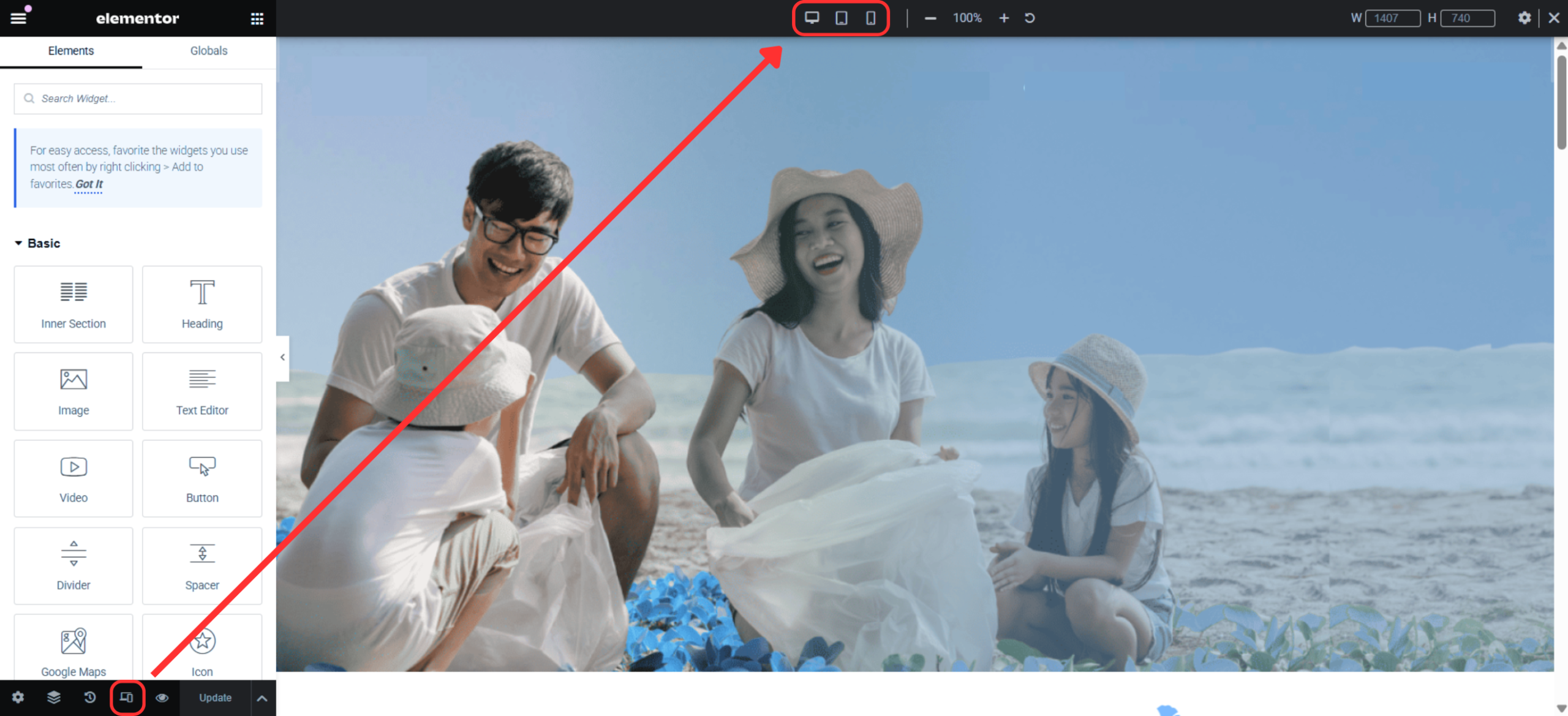
Step 1: Use Responsive Mode Icons

  1. Look at the bottom of the Elementor panel.

  2. You will see three icons:

    • 🖥️ Desktop

    • 📱 Tablet

    • 📱 Mobile

  3. Click on any icon to switch to that view mode.

The page preview will update instantly to match the selected device.

Edit Content for Mobile or Tablet

When in Tablet or Mobile mode:

  • Adjust font sizes, padding, and margins.

  • Hide or show widgets specifically for certain devices.

  • Reorder sections if needed.

💡 Tip: Changes marked with a device icon only affect that device view.

Switch Baack to Desktop Mode
  1. Click the Desktop icon at the bottom of the panel.

  2. Continue editing the desktop layout as usual.

Save Changes
  1. Click Update.

  2. Preview your page on actual devices if possible.

✅ Your responsive edits have been saved successfully.

2